Nothing that drove cart-adds was in the shopper's default path.
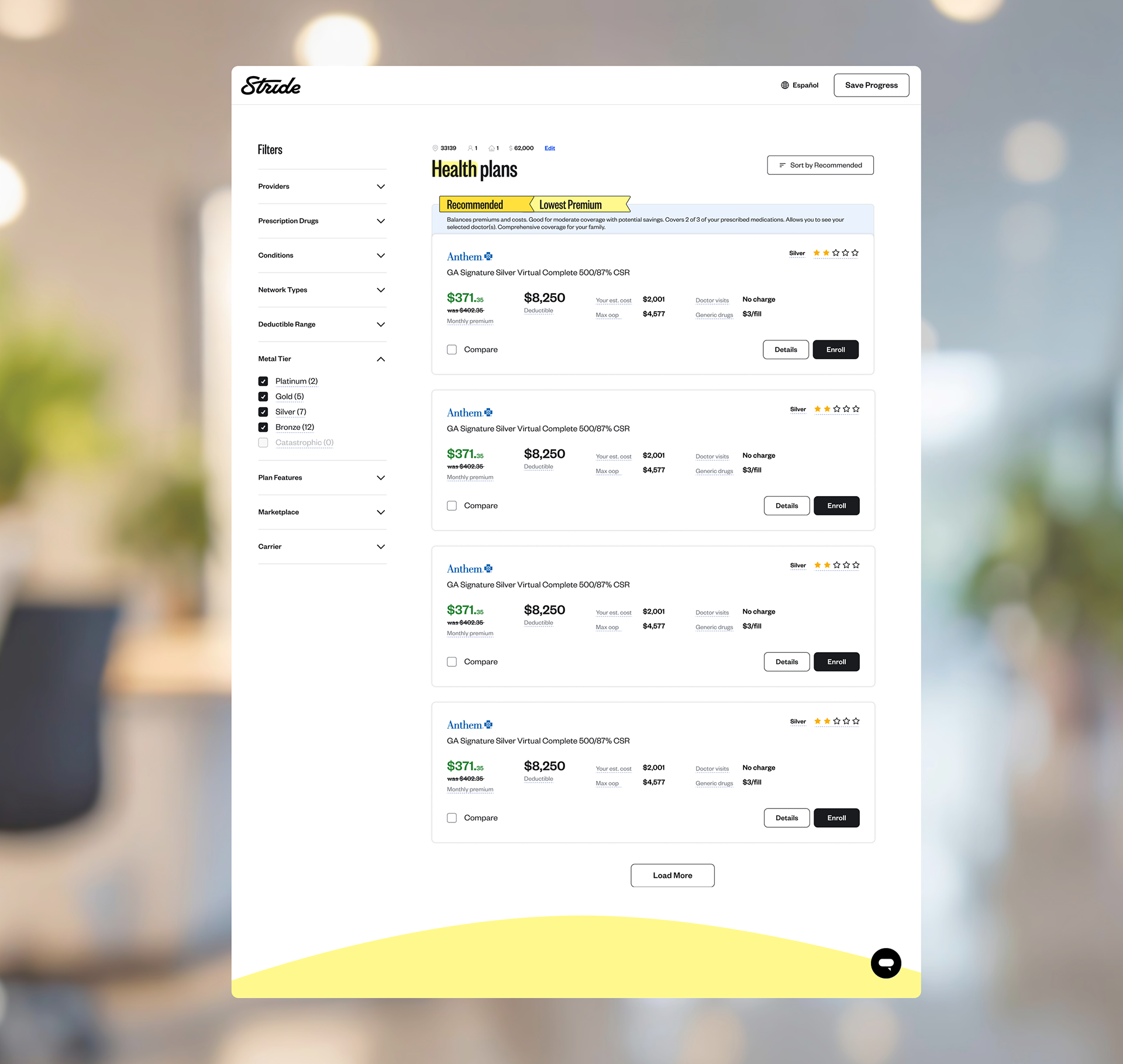
Shoppers were dropping off the plans page. The business goal was straightforward — get more of them to add a plan to cart. The data pointed at two features that worked, and at a layout that kept both of them out of the way.

The Problem:
Shoppers reached the plans page and left
Stride's job is to get 1099 workers into coverage. Everything upstream was working — people arrived, completed intake, and saw plans. Then the funnel stopped.
The goal: increase the number of shoppers who add a plan to cart.
Why cart-adds, not enrollments
Cart-to-enrollment didn't have a meaningful drop-off. Once a plan was in the cart, shoppers finished. So cart-adds was the last point where design could move the outcome — and lifting it would carry through to enrollment.
What the data already told me:
Two features moved cart-adds. Both were buried.
Before designing anything, I looked at what already correlated with the behavior we wanted. Two things stood out, and neither was a small effect.
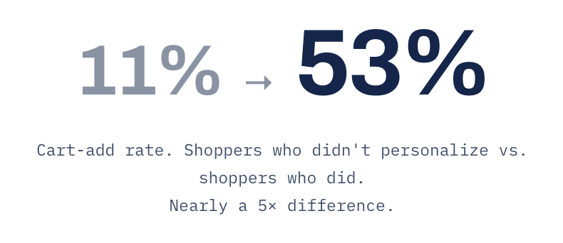
Personalization — added doctor, prescription, or condition
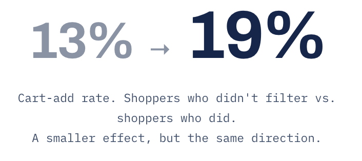
Filtering — used any filter on the plan list
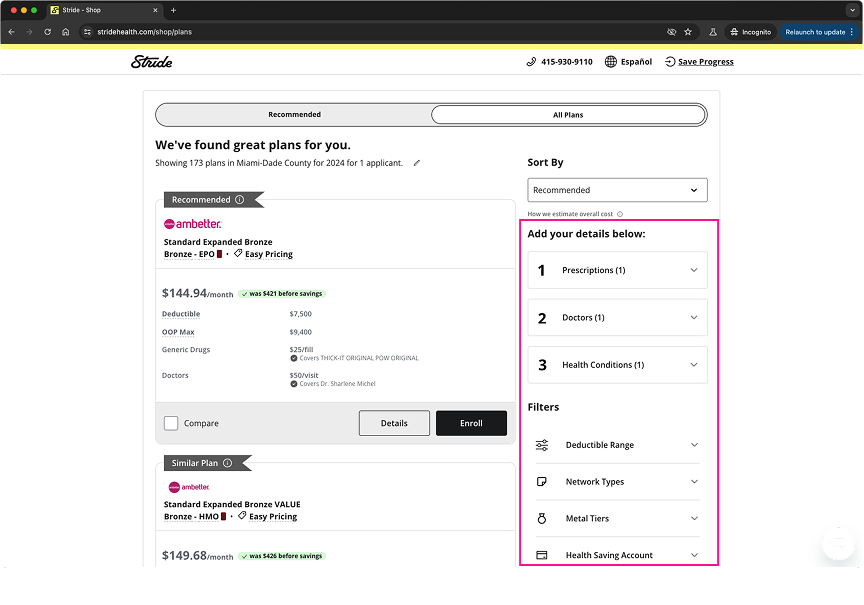
Both features lived in the same place: a right-hand sidebar on the results page. Personalization sat in an accordion below the sort control — three scroll positions beneath the recommendation it was meant to justify. Filters sat under it, on the side of the screen nobody scans first.
The tools that predicted conversion were the tools the layout treated as secondary.
The first decision:
Put both in the default path
I moved personalization into intake, ahead of results.
Asked before results rather than offered beside them. The plan count runs first, so shoppers see the search has already worked before being asked for more. Skip stays available on every screen.
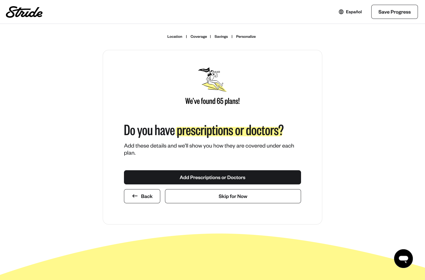
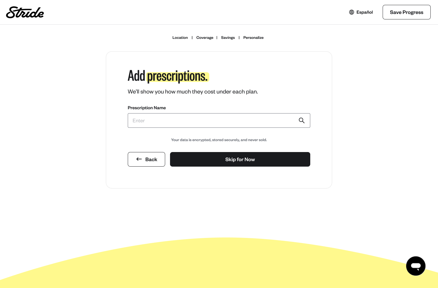
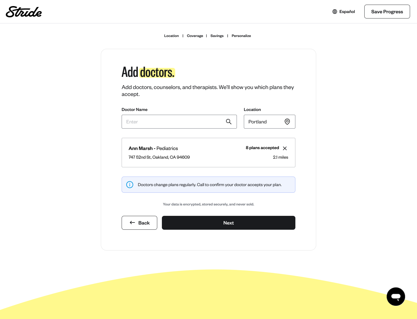
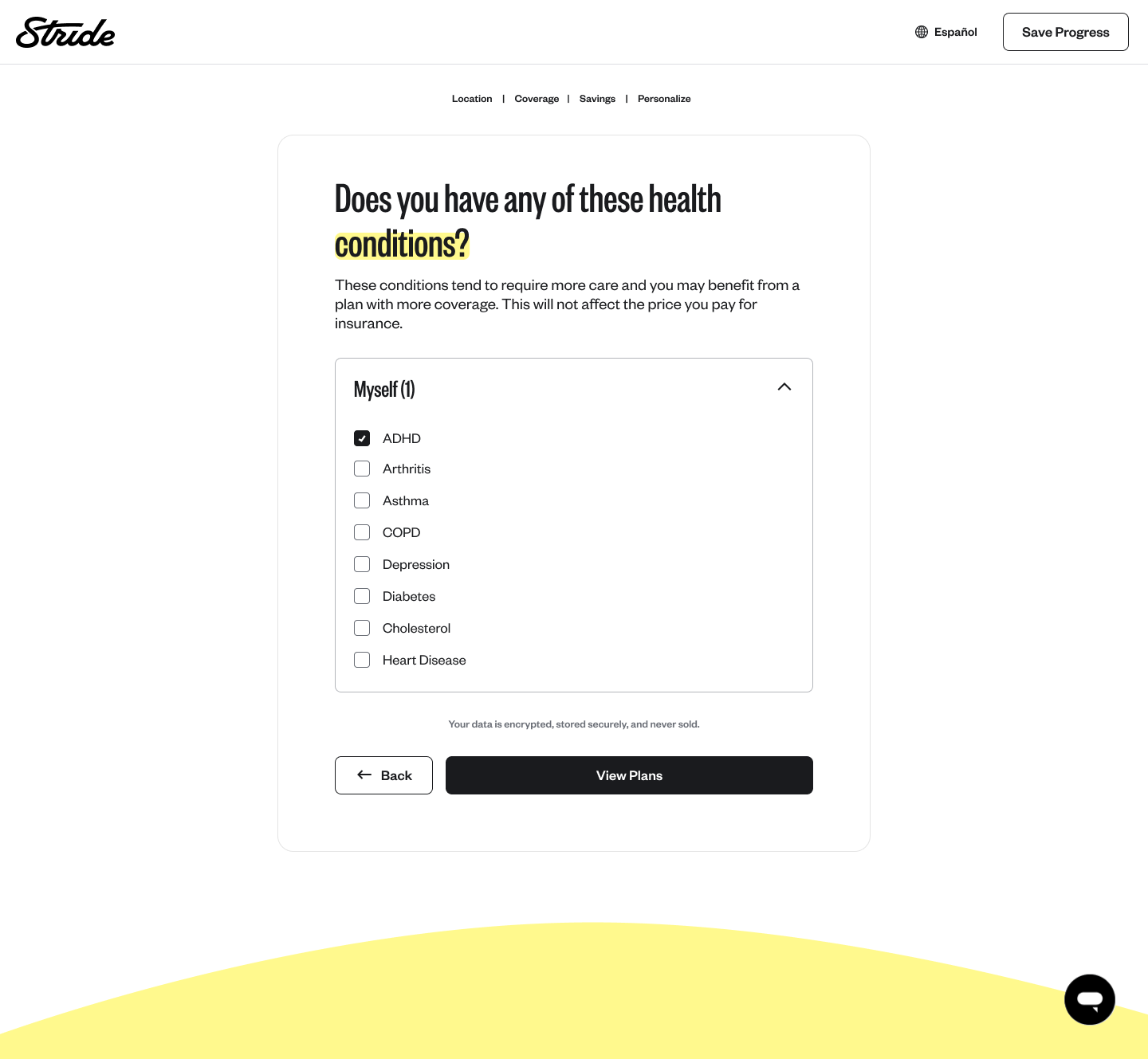
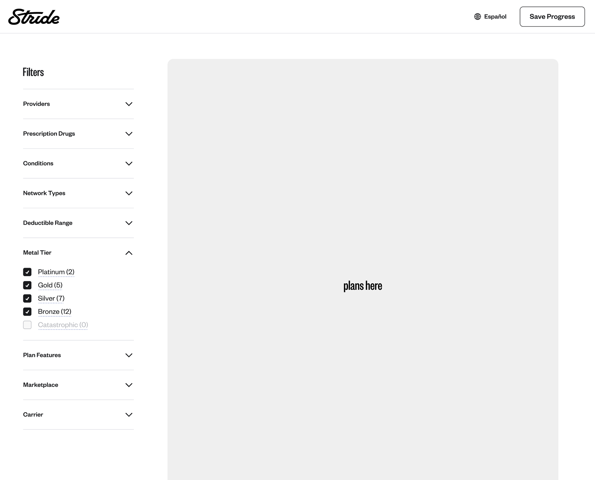
I rebuilt the filters and put them where shoppers already look.
People arrive knowing how filtering works from every other list they use, and the old placement made them relearn it here. I added counts to every option so narrowing never dead-ends at zero plans.
The second thing the data told me:
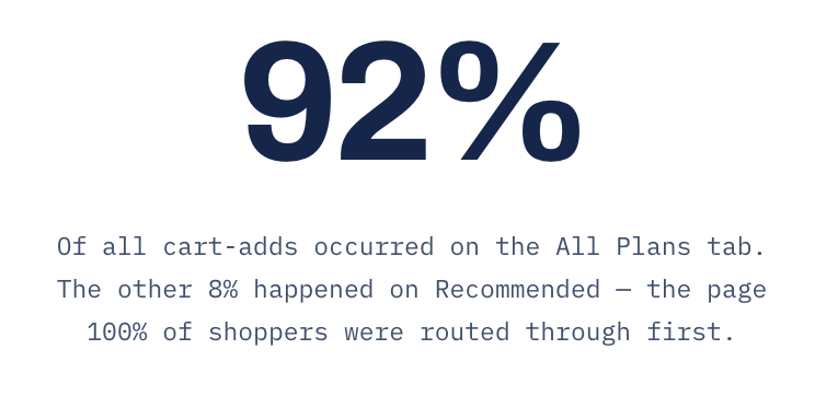
Every shopper was routed through a page almost nobody converted on
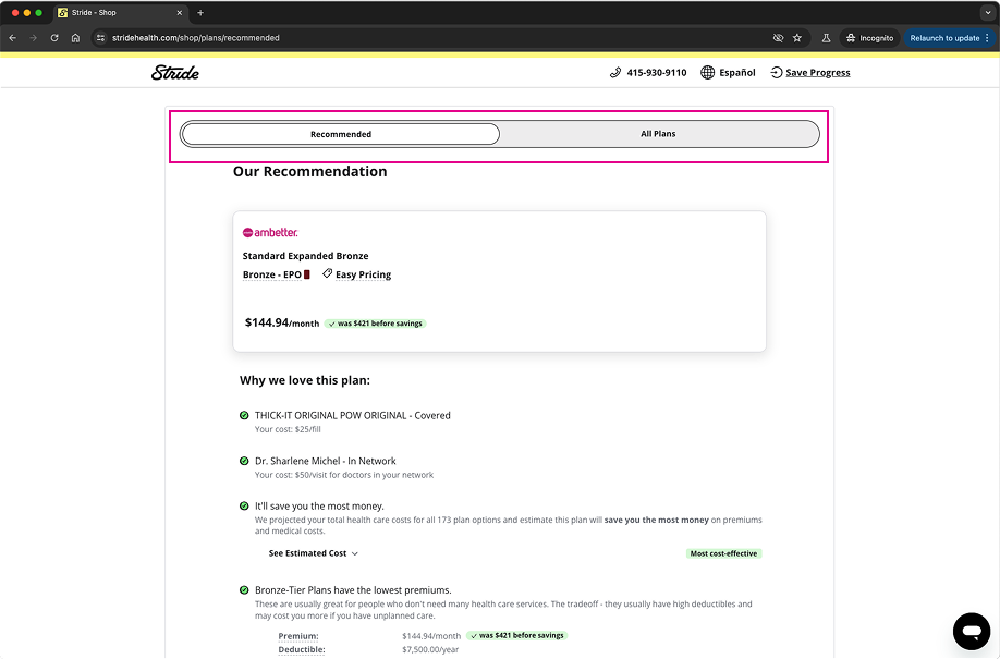
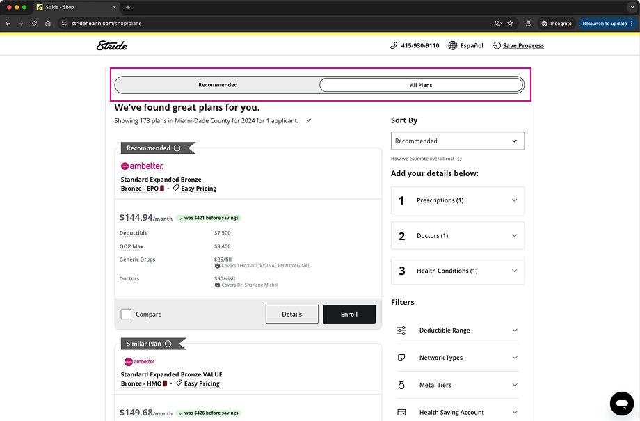
The results experience was split across two tabs: a single recommendation on one, the full plan list on the other. Recommended was the default. Everyone landed there.
Where cart-adds happened
Traffic between the tabs
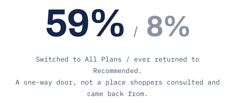
Everyone had to get past Recommended to reach the page they actually wanted to see. Shoppers went to the list to look at the other plans — what everything else cost, what they'd be giving up — and then picked. The tab assumed comparison was what happens when a recommendation fails. It's what makes one credible. So we were asking people to accept a pick before they could see what it beat.
The second decision:
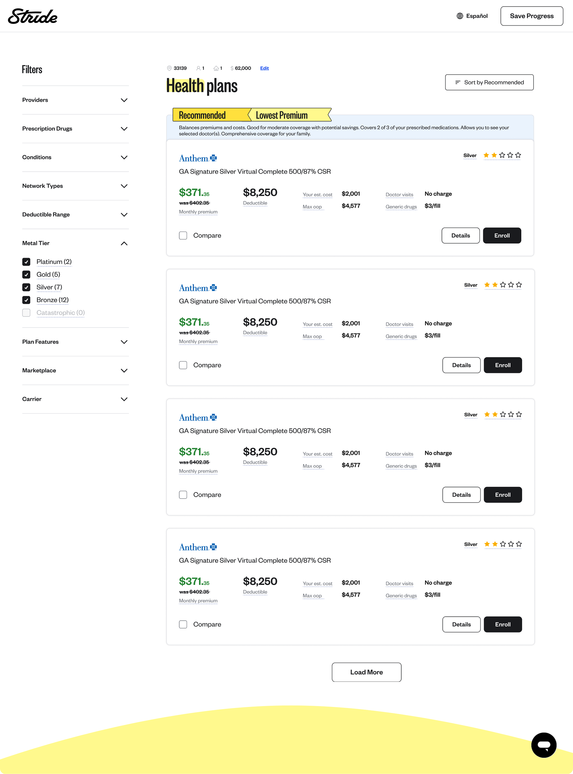
One page. The recommendation ranked inside the list.
I argued for removing the tab split entirely.
The recommendation stayed — but it belonged inside the thing shoppers used to check it, not in front of it. Shoppers now land where cart-adds already happened, with the recommendation flagged at position one, the filters they convert with on the left, and the personalization they've already completed feeding the ranking.
How we tested it:
We ran both designs at the same time
Open enrollment isn't comparable year to year. Plan prices move, subsidies change, and how much people can afford depends on the economy that season. Measuring this year against last would have told us about the market, not about the design.
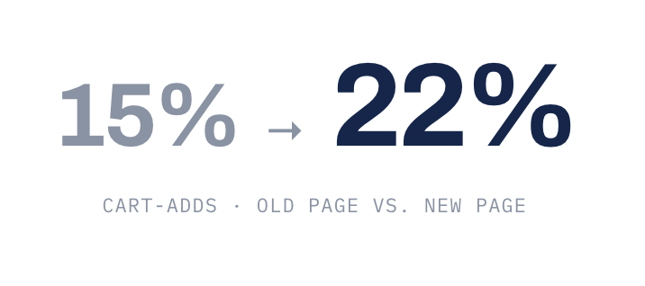
So we split the traffic. Half of shoppers saw the old plans page, half saw the new one, for two weeks of open enrollment. Same weeks, same prices, same kind of shopper. The only thing that changed was the design.
What the test could answer
Whether the new page got more people to add a plan to cart. That was the question I committed to before designing anything.
What it couldn't
Which change did the work. Everything shipped in one release, so the result covers all of it together.
Results:
What moved, and what it cost
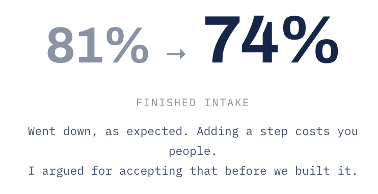
Cart-adds was the goal, but we lost something to get there. Fewer people finished intake, but more of the ones who did added a plan — and enough more that enrollments went up overall.
What I got wrong:
Those 8% were already going to buy
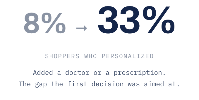
Finding personalization on the old page meant scrolling past the recommendation, opening a collapsed panel, and typing in your doctor's name. That's real effort. Nobody browsing casually did it. So the 8% who personalized were the most serious shoppers on the site. They were always going to convert well. The 53% described who they were, not what personalizing does.
They didn't buy because they personalized. They personalized because they were already going to buy.
Once it was easy, 33% did it — and that group included plenty of people who were only browsing. They converted at around 30%, well under the 53% I'd quoted. Still a big jump from 11%, still worth doing. But I'd suggested we would get to a number the work was never going to hit.